
Featured Artists
Leslie Cober-Gentry
About Leslie Cober-Gentry
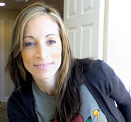
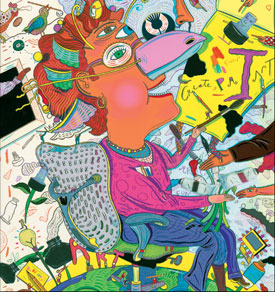
Leslie Cober-Gentry is well known for her unique and uplifting conceptual style. Her humorous illustrations are created in mixed media, which includes gouache, dip pen, India ink, colored pencil, and collage. Born in New York City in 1963, to a professional illustrator father and creative mother, at the age of 7 she began to pursue her dream of becoming a successful freelance illustrator. By 15, she completed her first assignment for the New York Times Op Ed page. After graduating from Syracuse University's School of Visual and Performing Arts in 1985, on merit scholarship, she continued to illustrate professionally for many of the most prestigious magazines, newspapers, corporations, and advertising agencies in the world.
Some of her clients include, The New York Times, Forbes, BusinessWeek, Entertainment Weekly, The Boston Globe, The Los Angeles Times, Hallmark Cards, Sony Records, Ford, Chevrolet, and the Entergy Corporation. She has won several awards including one from the Society of Publication Designers and Print's Regional Design Annual, a gold medal from the 2006 Vision Awards Annual Report Competition, a bronze award from the 21st Annual Mercomm/ARC awards Competition, an American Graphic Design Award from Graphic Design USA, a Children's Choice Award for "Sisters Club" by American Girl, and has been included in the book, American Illustration, as well as a juror for the prestigious Society of Illustrator's Show. Artist Magazine featured Cober-Gentry in a special section titled, "Crossing the Bridge to Illustration...What you need to know to make it in the Illustration field. Today's top illustrators share their wisdom." Several illustration "How to" books, including the "The Desktop Designer's Illustration Handbook" and "The Best of Best Brochure Design" have included Cober-Gentry's work as examples of successful illustrations and how they were developed.
Now after 20 years illustratring over 1000 assignments for many of the top publications and corporations in the world, Cober-Gentry as serves as an adjunct assistant professor of illustration at the Fashion Institute of Technology in New York City. This is a natural continuation of her love of the illustration profession. She plans to complete a Master of Fine Arts degree in illustration in the summer of 2011 and is diligently working from her home studio on a children's picture book she has written and illustrated. Leslie Cober-Gentry lives in Fairfield, Connecticut with her husband and two children.
Gene Ploss
About Gene Ploss
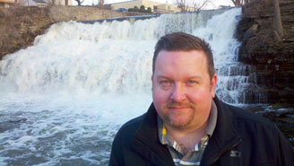
Gene G. Ploss Jr. was born in Frankfurt, Germany in 1969. Son of a third generation dairy farmer, he was raised in a rural farming community in Western New York.
In 1993 he graduated from SUNY Fredonia with a Bachelor of Fine Art Degree. He now resides in Buffalo, New York where he works as a sign maker, fine artist and illustrator. Gene works mainly in graphite, colored pencil, ink, watercolor and acrylic with a focus on figures and portraits.
Interview with the Artist
How did you interpret using the Strathmore Thistle for the pad cover artwork? Anything else you'd like to share about your piece?
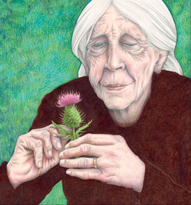
I wanted to create an image that would show someone quietly and thoughtfully studying the thistle. They are looking past the façade of sharp thorns to see the vibrant colors and graceful shapes beneath.
As I often do, I chose an elderly person as my subject. I have always been fascinated with old faces because they are so rich with character and so full of detail. It's very satisfying to draw them. I can't get enough.
How did the Strathmore paper you used for the project affect your drawing (or painting) techniques?
This paper made drawing worry-free and more enjoyable. The surface is smooth, but still has a nice tooth. I usually apply several layers of colored pencil and graphite on my drawings. Some papers don't react well to this treatment and won't accept all the layers of color. This Strathmore product is a thick, fine quality paper and it performed very well. I didn't have to adjust my technique because I thought the paper might buckle or tear. It holds up well even under heavy pencil pressure and repeated erasure use.
Which artists inspire you?
Here are some artists that have definitely influenced me over the years: Norman Rockwell, Alphonse Mucha, David Lance Goines, Sebastian Kruger, Chris Wahl, Bruce Sereta, Travis Loui &, Fred Harper.
What advise would you give to beginning artists?
I tell beginners to do three things.
- Practice! Draw every day. Do it as much as you can. Always carry a sketch book with you and when you see something that strikes you, draw it! Something that doesn't seem too important at the time can become great when you look back on your drawings from that moment.
- Search out inspiration constantly. It is so important to stay inspired. It is very easy to get in a rut and become indifferent. Go to galleries and look at other artists work. Spend time at the library looking at books and magazines. Take note of advertising, greeting cards, road signs, anything that gets your creative juices flowing. Get out of your house and explore the world around you. You'll never know what will inspire your next series.
- Don't get discouraged. I was lucky enough to have encouraging people around me when I began developing my interest in making art. It's very easy to let criticism throw you off your chosen path. Don't let anyone steer you away. Persevere and you will succeed!
Curtis Bartone
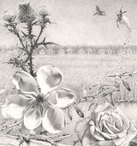
About Curtis Bartone
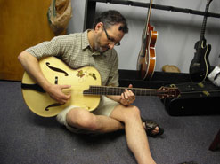
Curtis Bartone was born in 1965 in Erie, Pennsylvania. He received a BFA from the Columbus College of Art and Design and an MFA in painting from Northwestern University in Chicago. He lived in Chicago from 1989 until 2001 and relocated to Savannah, Georgia in 2001 where he currently lives. The landscape and wildlife of the lowcountry environment and its contrast with manmade elements has become an integral theme in his work.
Curtis Bartone's work focuses on the uneasy relationship between human beings and the natural world, addressing the concept of wilderness, which is typically presented as a distorted fiction rather than a mysterious, pristine reality. The disparate flora and fauna presented in Bartone's art are often drawn from his personal experience of the natural environments of far-flung countries including Iceland, Czechoslovakia, Austria, Hungary, Zambia, and New Zealand. Filtered through art history and mass media, his works synthesize seemingly disparate elements, revealing connections, beauty, and order amidst apparent disharmony. Bartone's work has been included in numerous group exhibitions internationally, and in solo exhibitions at the Telfair Art Museum in Savannah, Georgia; Byron Roche Gallery; the Morris Graves Museum of Art in California: SPACE Gallery in Savannah; Gallery Stokes in Atlanta; Listagil Gallery in Akureyri, Iceland; the Elmhurst Art Museum in Illinois; the Erie Art Museum in Pennsylvania and the University of Illinois in Chicago, among other institutions. Bartone was the recipient of the Gil Society Studio Residency Fellowship in Akureyri, Iceland in 2005. His work is included in numerous public and private collections.
Interview with the Artist
How did you interpret using the Strathmore Thistle for the pad cover artwork? Anything else you'd like to share about your piece?
The thistle was easily incorporated into my drawing because my work often includes beautiful plants that evolve to defend themselves in various ways--by becoming poisonous or, in this case, by developing sharp thorns. In fact, when I was contacted to do a drawing for Strathmore, I had already included thistles in several drawings and paintings.
How did the Strathmore paper you used for the project affect your drawing (or painting) techniques?
The fine tooth of the 400 series paper is perfect for a detailed graphite drawing. The texture was fine enough to hold detail and crisp lines, while the paper was just "soft" enough to allow for some softening of edges.
Which artists inspire you?
There are so many artists that inspire me that I lose track of them. I like to look at art as much as I like to make art. My biggest inspiration, both technically and conceptually, comes from the Dutch still life painters of the 17th century, artists of the 18th and 19th century and natural science illustrators like John James Audubon. I am influenced and awed by many artists from the Renaissance: Leonardo Da Vinci, Albrecht Durer, Giovanne Bellini, and Heironymous Bosch. I also like many contemporary artists--Odd Nerdrum, a Norwegian narrative figure painter; Walton Ford, who creates very large, technically stunning watercolor and ink images of what look initially like Audubon illustrations; Chicago artist Laurie Hogin, who paints menacing, Baroque animals in tempestuous settings--to name only a few.
What advice would you give to beginning artists?
I would give the same advice to a beginning artist as I would to anyone starting out in any field: Work hard and keep working no matter what. It sounds easy, but the trick is to KEEP working hard even when you are not being paid or when you don't have an upcoming exhibition. That's where most artists fail; they stop making work when the outside world stops looking.
Melissa Tubbs
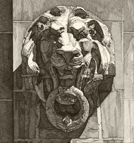
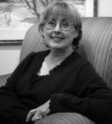
Melissa B. Tubbs creates finely-detailed pen-and-ink drawings of architectural subjects. It was after completing her first pen-and-ink drawing of a house that she discovered her love of architecture as subject matter. She is a preservationist with pen and paper who whole heartedly believes in the old proverb: "The wise man preserves that which he values and celebrates that which he preserves." Form, line, and light have more emphasis in black and white, perfect for rendering architectural elements and ornamentation. She is interested in conveying the depth created by the contrast of bright light and cast shadows.
Ms. Tubbs work has been shown throughout the United States. Her accomplishments include: 75th National Midyear Exhibition, 2011, at The Butler Institute of American Art, Youngstown, OH; "Drawing on Alabama 2011," Auburn University, Auburn, AL; "The Ink Drawings of Melissa B. Tubbs," solo show at the Montgomery Museum of Fine Arts; "Carnegie Hall, NYC" included in Strokes of Genius 2: The Best of Drawing Light and Shadow published October 2009; an article featuring her pen-and-ink drawings in the November 2004 issue of American Artist magazine; one of three artists exhibited in "An Absence of Color," 2004, at Marymount Manhattan College in New York City; represented the state of Alabama in creating a three-dimensional architectural ornament of a historical home for the Official White House Christmas Tree for 2001 (the ornament is now in the White House permanent ornament collection). Melissa lives and works in Montgomery, AL.
Interview with the Artist
How did you interpret using the Strathmore Thistle for the pad cover artwork? Anything else you'd like to share about your piece?
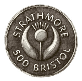
I decided the right place for the thistle in my drawing was as a bas relief on the bottom of the ring hanging from the lion's mouth. Integrating it into the drawing this way made it look as though it has always been there. I chose the terra-cotta lion head mask for the cover piece because of its powerful look, especially with the strong sunlight and cast shadows.
How did the Strathmore paper you used for the project affect your drawing (or painting) techniques?
Drawing on the buttery smooth-surface 400 series paper is pure pleasure. My pen point just glides along with each stroke. The lines are crisp and clear which makes a beautiful finished piece as well as perfect for scanning for reproduction purposes. It makes it easy to focus on drawing because I don't have to think about technicalities with my materials.
Which artists inspire you?
Two artists have influenced my work: Albrecht Dürer and Barry Moser, both printmakers. I have looked at Dürer's woodcuts and Moser's wood engravings because there is nothing tentative about their line work and I want the same feel for the line work in my drawings. When I put a line down, I know that is where I want it to be and how I want it to look.
What advice would you give to beginning artists?
Draw, draw, draw and then draw some more. Drawing is the foundation for being skilled in whatever medium you want to use. Picasso, among many other artists, was a great draughtsman before he started breaking the human figure apart putting noses on the tops of heads and eyes here and there in his paintings. You have to know the rules well before you can break them. Drawing comes first.
William Rose
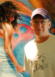
William Rose, a figurative/portrait artist from Kansas, is garnering considerable attention on a national level as one of a select group of very talented representational figurative artists painting today. Following creative bursts in music and writing, he stumbled across a talent - which quickly became a passion - for drawing and painting. A steady stream of requests for figurative and portrait work from many local and high-profile national collectors soon followed, including representation by multiple fine art galleries.
In addition to appearing in a wide range of national publications and juried shows - including covers for American Artist Magazine and Poets & Artists - William produced all of the artwork for a new film associated with the Eastwoods in Carmel about a teenage art prodigy.
His artwork has recently been featured in national art competitions including Artist Magazine's "The Year's Best Art", American Artist Magazine's 70th Anniversary Competition, and International Artist Magazine's 2009 Annual competition. Recently, his work has graced the cover of Poets & Artists, and was featured in the new national art quarterly, Blue Canvas. In November William will have his first major solo Museum exhibit at the prestigious Albrecht-Kemper Museum of Art.
Interview with the Artist
How did you interpret using the Strathmore Thistle for the pad cover artwork? Anything else you'd like to share about your piece?
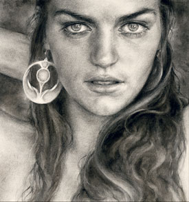
Since my drawing was going to be a female portrait, I considered a couple of options to incorporate a representation of the Strathmore thistle. The two options I narrowed it down to were the earring and placing an actual thistle in the model's hair. Erin - the model I used for the drawing - had beautiful large gold earrings that worked perfectly - simply converted through the magic of charcoal into a thistle. And I believe as you look at the drawing it's easy to see why I chose Erin as the subject - unbridled emotion nearly bleeds from her eyes. For me, representing emotion like that in charcoal or paint, induces a creative state that continually pulls me back to the easel.
How did the Strathmore paper you used for the project affect your drawing (or painting) techniques?
I've used the 400 series drawing paper for many of my charcoal and graphite drawings over the years. I love the texture - not too smooth / not too rough - and it's strong enough to beat up a little with numerous layers of both compressed charcoal and the softer vine charcoal. For the kind of work I usually create, it's - simply put... the perfect paper.
Which artists inspire you?
I can't even begin to list all of the incredible artists who have inspired me. And the list is constantly evolving. As my work is primarily figurative, I am always on the prowl for inspiration from today's amazingly diverse and talented contemporary artists like Lipking, Kanevsky, Calibey, Liepke, Carson, Francis - man I could go on and on. And as I work to incorporate a looser, more expressive style, I'm beginning to draw tremendous inspiration from the abstract expressionists of the 50's.
What advice would you give to beginning artists?
Learn to draw - and I know it's easier for some than others - but above all else - acquire the ability to guide your hand to create on paper or canvas what your eyes see. If you can do that first, then you can do anything.


